
What’s the best CTA for Visual Bites to boost recipe discoverability for foodies?
Understanding the Foodie’s Journey
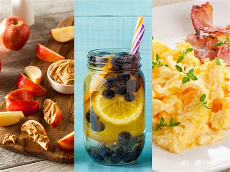
For foodies, the journey of discovering a new recipe often begins with a captivating visual. ‘Visual Bites’ platforms, which prioritize high-quality food photography and short, engaging videos, naturally appeal to this audience. However, merely showcasing stunning visuals isn’t enough; the key lies in guiding the user from passive admiration to active engagement and, ultimately, recipe discovery. The challenge is to craft a Call-to-Action (CTA) that feels intuitive, adds value, and seamlessly integrates into the visual experience.
Before diving into specific CTAs, it’s essential to understand the mindset of a foodie on such a platform. They are likely seeking inspiration, new ideas, or practical recipes to try. They appreciate aesthetic appeal but also value ease of access and clear instructions. A CTA should resonate with these motivations, encouraging them to take the next logical step without feeling pushy or disruptive.
The Power of Clear and Direct CTAs
Sometimes, simplicity is key. A direct CTA leaves no room for ambiguity and clearly tells the user what action to take. For Visual Bites, this could manifest in several ways:
- “View Recipe” / “Get the Recipe”: This is perhaps the most straightforward and universally understood CTA. It directly addresses the user’s likely intent after being drawn in by a visual. Placing it prominently ensures immediate access.
- “Cook This Now”: A more action-oriented and urgent CTA that can appeal to foodies looking for immediate culinary gratification. It implies ease and quick access to the cooking process.
- “Save for Later”: Recognizing that not all recipe discovery leads to immediate cooking, providing an option to save a recipe allows users to curate their collection, fostering long-term engagement and repeat visits.
The effectiveness of direct CTAs often hinges on their placement and visual prominence, ensuring they are easily clickable without detracting from the visual appeal of the dish itself.
Engaging CTAs for Deeper Interaction
Beyond simply viewing a recipe, foodies often enjoy community and deeper engagement. CTAs that foster this can significantly boost discoverability through shared experiences:
- “Share Your Creations”: While not directly a recipe discoverability CTA, encouraging users to share their results for a specific recipe can create a feedback loop, generate user-generated content, and inspire others to try it.
- “Join the Discussion”: For recipes that might have variations or tips, a CTA that leads to comments or a forum section can increase time spent on the platform and expose users to alternative ideas.
- “Explore Similar Recipes”: Leveraging AI and user behavior, this CTA can lead users down a rabbit hole of related content, significantly increasing discoverability based on their initial interest.
These CTAs transform a passive viewing experience into an interactive one, making the platform a hub for culinary exchange rather than just a recipe database.
Personalized and Contextual CTAs
The ‘best’ CTA is rarely a one-size-fits-all solution. Personalization and context play a crucial role in maximizing effectiveness:
- Dynamic CTAs: Based on user history (e.g., if they’ve saved similar recipes before), the CTA could change from “Save for Later” to “Start Cooking” if the recipe aligns with their usual cooking habits.
- Time-Sensitive CTAs: For seasonal or trending recipes, a CTA like “Perfect for [Holiday Name]!” or “Try This Summer Treat!” can add a layer of relevance.
- “Add to Meal Plan”: For platforms that offer meal planning features, this CTA directly integrates the discovered recipe into a larger user workflow, enhancing its utility and stickiness.
By tailoring CTAs to individual preferences and the specific context of the content, Visual Bites can create a more intuitive and helpful user experience, naturally guiding foodies towards recipes they are most likely to enjoy and prepare.
Optimizing CTA Placement and Design
Even the perfect CTA text can fail if its execution is poor. Design and placement are paramount on a visual-first platform:
- Above the Fold: Ensure primary CTAs are visible without scrolling, especially for recipe details pages.
- Contrast and Clarity: The CTA button or link should stand out visually against the background without clashing with the overall aesthetic. Use contrasting colors, appropriate sizing, and clear fonts.
- Mobile Responsiveness: Given that many foodies browse on mobile, CTAs must be easily tappable and accessible on smaller screens.
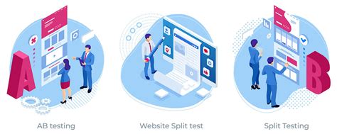
- Testing and Iteration: A/B testing different CTA texts, colors, and placements is crucial for continuous improvement. Data on click-through rates will reveal what resonates most with the target audience.
Ultimately, the best CTA for Visual Bites is one that harmonizes with the platform’s visual identity, addresses the foodie’s immediate need or desire, and effectively shepherds them towards the invaluable content: the recipe itself. By focusing on clarity, engagement, personalization, and meticulous design, Visual Bites platforms can unlock unparalleled recipe discoverability.