
How to use color & texture for stunning recipe presentation on visual feeds?
In today’s visually-driven world, especially on platforms like Instagram, Pinterest, and TikTok, the presentation of your recipes is just as crucial as their taste. A beautifully composed dish can stop scrollers in their tracks, enticing them to try your recipe. The secret to this captivating power often lies in the thoughtful application of color and texture. Let’s dive into how these two elements can transform your recipe photos from ordinary to extraordinary.
The Power of Color in Food Photography
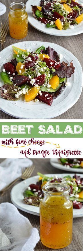
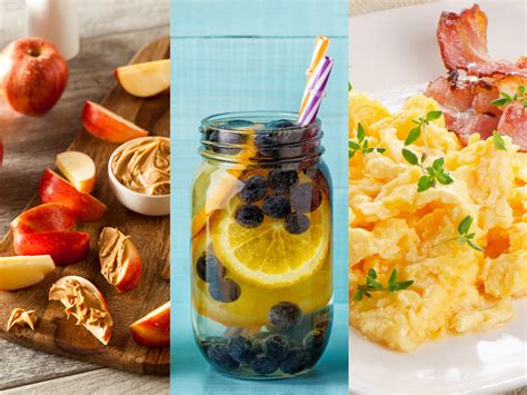
Color is the first thing that catches a viewer’s eye. Vibrant, fresh colors instantly signal health, deliciousness, and freshness. Think about the rich red of ripe tomatoes, the verdant green of fresh herbs, or the golden-brown crust of a perfectly baked pastry. Utilizing a diverse palette can make your dishes pop and communicate their essence even before someone reads the caption.
Understanding basic color theory can elevate your food styling. Complementary colors (like red and green, or yellow and purple) create a dynamic contrast that makes elements stand out. Analogous colors (colors next to each other on the color wheel, like yellow, orange, and red) provide a harmonious and soothing feel. Alternatively, a monochromatic scheme, using different shades and tints of a single color, can be incredibly elegant and sophisticated.
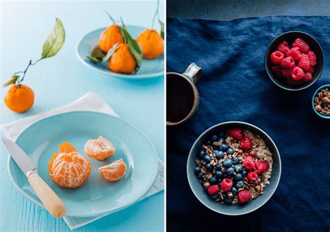
Don’t be afraid to introduce a ‘pop’ of color. A sprinkle of fresh parsley on a creamy pasta dish, a few blueberries on a stack of pancakes, or a zest of lemon can provide that crucial visual spark that prevents a photo from looking bland. Focus on showcasing the natural hues of your ingredients, as they are often the most appetizing.
Embracing Texture for Visual Interest
While color draws the eye, texture invites the viewer to imagine the tactile experience of eating the food. A photograph needs to convey crispiness, creaminess, juiciness, or crunch without the viewer actually being able to touch or taste the dish. This is where contrasting textures become incredibly powerful.
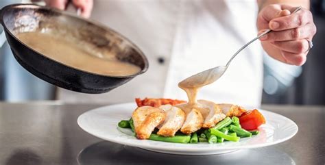
Consider a smooth, velvety soup juxtaposed with crunchy croutons, or a flaky salmon fillet paired with a silken sauce. These contrasts create depth and dynamism in your image, making the food look more appealing and multi-dimensional. Think about layering; a dish with visible layers of different textures tells a more compelling story.
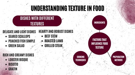
Garnishes are not just for color; they are fantastic for adding texture. Chopped nuts, toasted seeds, fresh herbs, or even a drizzle of a thick sauce can introduce a new textural element. Lighting also plays a crucial role in highlighting texture; strong side-lighting or back-lighting can cast shadows that emphasize the contours and ridges of food, making textures truly stand out.
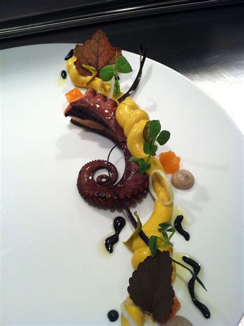
Strategic Pairing: Color & Texture Harmony
The magic truly happens when you consciously combine color and texture. Imagine a vibrant, green pesto pasta with visible ridges of parmesan cheese and the glossy sheen of olive oil, all topped with a sprinkle of crushed red pepper flakes for a subtle color contrast and a hint of extra crunch. Each element contributes to a sensory feast, even in a two-dimensional image.
When styling, think about how different components of your dish contribute to both visual aspects. A bright, colorful vegetable medley gains more appeal when you highlight its varied textures – the crispness of bell peppers, the tenderness of zucchini, and the slight char from roasting. Layering ingredients with both complementary colors and contrasting textures will make your presentation more sophisticated and enticing.
Practical Tips for Stunning Visuals
Plating with Purpose
Don’t just dump ingredients on a plate. Arrange them thoughtfully. Use negative space to your advantage, allowing key ingredients to breathe and stand out. Create a focal point and arrange other elements around it to guide the viewer’s eye. A well-composed plate naturally enhances both color and texture.
Backgrounds & Props
Keep your backgrounds simple and uncluttered so the food remains the star. Neutral tones or subtle textures like wood, stone, or linen work wonderfully. Use props sparingly and ensure they complement, rather than distract from, your dish. A rustic fork, a crumpled napkin, or a sprig of the main herb used in the recipe can add context and depth without overpowering the main subject.
Conclusion: Elevate Your Culinary Storytelling
By consciously integrating color and texture into your recipe presentation, you’re not just taking a picture; you’re telling a story. You’re conveying the freshness of ingredients, the richness of flavors, and the delightful experience that awaits. Experiment with different angles, lighting, garnishes, and plating techniques. With practice, you’ll develop an eye for what makes a dish truly visually irresistible, turning casual scrollers into eager home cooks. Start seeing your ingredients as an artist sees paint and clay, and watch your recipe presentations transform into works of culinary art.