Best CTA for Visual Bites to increase recipe conversions on mobile?
Optimizing Call-to-Actions for Mobile Recipe Conversions
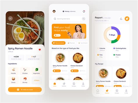
In the fast-paced world of mobile content, “Visual Bites”—short, engaging video clips or image sequences showcasing recipes—have become a powerful tool for food content creators. These bite-sized experiences are designed to capture attention quickly, inspire culinary creativity, and ultimately drive users towards trying a recipe. However, the journey from inspiration to actual recipe conversion on a mobile device is often fraught with friction, and the humble Call-to-Action (CTA) plays a pivotal role in bridging this gap.
For Visual Bites, where user engagement time is minimal and screen real estate is precious, the CTA must be incredibly effective. It needs to be clear, compelling, and seamlessly integrated into the mobile user experience to maximize the chances of a user moving past the initial delight of the visual content and into the cooking process.

Core Principles for High-Converting Mobile CTAs
Crafting the perfect CTA for Visual Bites on mobile requires adherence to several key principles that account for user behavior, mobile constraints, and the specific goal of recipe conversion.
1. Clarity and Conciseness Above All Else
A mobile CTA must be instantly understandable. Vague or overly creative language can lead to confusion and abandonment. Users should know exactly what will happen when they tap. For recipe conversions, direct phrases like “View Recipe,” “Cook Now,” or “Get Full Recipe” are highly effective. Avoid jargon or multiple steps within the CTA text itself.
Consider the immediate gratification a user seeks after watching an enticing food video. The CTA should promise a straightforward path to fulfilling that desire. It’s not just about telling them what to do, but about signaling the immediate benefit and ease of access to the next step.

2. Strategic Placement and Prominence
Mobile screens are small, meaning prime visibility is crucial. CTAs should be placed where they are easily seen without excessive scrolling—ideally above the fold or in a sticky position that remains visible as the user scrolls through comments or related content. The button itself needs to stand out visually through contrast in color, size, and whitespace.
Avoid cluttering the area around the CTA. Give it room to breathe, making it an obvious focal point. For video-based Visual Bites, consider overlaying the CTA subtly at the end of the video or having it appear prominently once the video concludes.
3. Design for Tappability and Accessibility
Mobile CTAs must be large enough to be easily tapped with a thumb or finger without accidentally hitting surrounding elements. A minimum tap target size of 44×44 pixels is often recommended. Furthermore, ensure sufficient color contrast between the button and its background, as well as between the text and the button, to meet accessibility standards and improve readability for all users.

4. Offering Diverse Value Propositions
While “Cook Now” is a primary goal, not every user is ready to cook immediately. Providing alternative CTAs can capture different user intents and lead to conversions down the line. Examples include:
- “Save Recipe”: For users who want to try it later.
- “Add to Shopping List”: For those planning a grocery trip.
- “Watch Full Demo”: For visual learners needing more guidance.
- “Print Recipe”: For traditional cooks.
These options cater to various user journeys, nurturing leads rather than losing them if they’re not instantly ready to cook. Offering a primary CTA (e.g., “View Recipe”) and a secondary CTA (e.g., “Save”) can be an effective strategy.
Advanced Strategies for Maximizing Conversions
Beyond the basics, leveraging personalization and continuous optimization can significantly enhance your CTA performance.
Personalization and Contextual Relevance
If you have user data (e.g., dietary preferences, past viewed recipes), tailor CTAs to be more relevant. For instance, a user who frequently views vegetarian recipes might see a “Cook This Vegan Meal” CTA. Contextual relevance based on time of day (e.g., “Dinner Inspiration”) or seasonality can also boost engagement.
A/B Testing and Analytics
The only way to truly know what works best for your audience is through rigorous A/B testing. Test different CTA texts, colors, sizes, placements, and value propositions. Use analytics tools to track click-through rates (CTR), conversion rates, and user flow to identify bottlenecks and successful variations. This iterative process is key to continuous improvement.

Conclusion
The success of Visual Bites in driving recipe conversions on mobile hinges significantly on the effectiveness of your Call-to-Action. By focusing on clarity, strategic placement, user-friendly design, and offering diverse value propositions, content creators can transform passive viewers into active cooks. Remember to continuously test and refine your CTAs based on data, ensuring they remain the most efficient bridge from inspiration to culinary action.

