Best Visual Bite CTA to drive recipe card clicks from mobile foodies?

Capturing Attention: The Mobile Foodie Challenge
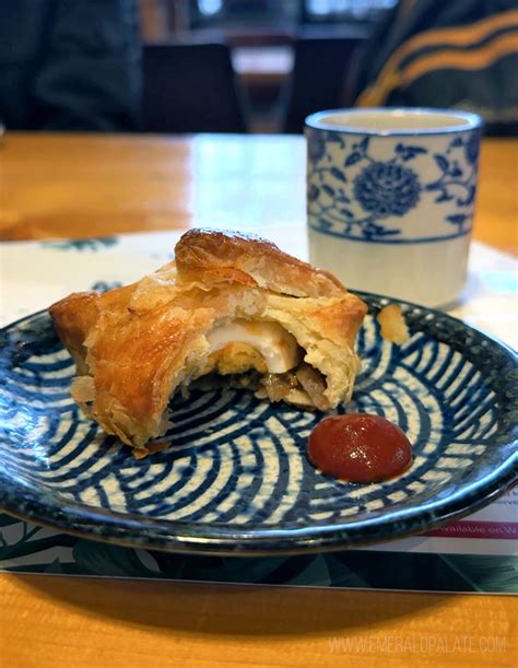
In the fast-paced world of digital food content, mobile foodies are a unique audience. They scroll rapidly, have short attention spans, and are constantly bombarded with visuals. For creators of ‘Visual Bites’ – short, engaging food videos or image carousels – the challenge isn’t just to create mouth-watering content, but to effectively funnel that interest into a recipe card click. The right Call-to-Action (CTA) is paramount, acting as the critical bridge between a fleeting impression and a meaningful engagement. Without an optimized CTA, even the most stunning visual bite risks becoming just another scroll-past.

Understanding the Mobile Foodie’s Journey
Before designing your CTA, it’s vital to step into the shoes of the mobile foodie. They are often on the go, browsing during commutes, quick breaks, or while multitasking. Their interaction is highly visual and typically sound-off. This means your visual bite must be instantly appealing, convey its deliciousness in seconds, and your CTA needs to be equally clear, concise, and compelling. The goal is to minimize friction and make the next step – clicking for the recipe – feel intuitive and rewarding.
Key Principles for High-Converting Visual Bite CTAs
- Clarity & Conciseness: Use unambiguous language. “Get Recipe,” “View Full Recipe,” “Tap for Ingredients” are far more effective than vague prompts.
- Visibility & Placement: The CTA must be immediately noticeable without being intrusive. Consider overlays, end screens, or well-integrated text within the visual.
- Urgency & Benefit: While not always applicable, subtly implying a benefit or a sense of urgency can boost clicks. “Cook This Tonight,” “Unlock the Secret Recipe.”
- Visual Appeal: The CTA itself should be visually engaging, matching the aesthetic of your visual bite and brand.
- Mobile Optimization: Ensure the CTA button or text is finger-friendly and loads quickly on mobile devices.

Top Visual Bite CTA Strategies for Recipe Card Clicks
1. Direct & Unambiguous CTAs
These are the workhorses. Phrases like “Get the Recipe,” “View Full Recipe Here,” or “Recipe Details” leave no room for doubt. They are effective because they clearly communicate the immediate next step and the value offered.
- Placement: As an overlay during the last few seconds of a video, or prominently below an image carousel.
- Design: A clear, contrasting button or text link.
2. Benefit-Driven CTAs
These CTAs go a step further by highlighting what the user gains. Instead of just “Get Recipe,” try “Cook This Delicious Meal,” “Master This Dish,” or “Taste the Flavors – Get Recipe.”
- Placement: Often works well integrated into a final text frame or video outro.
- Design: Can be slightly more descriptive, perhaps with a smaller font for the benefit and a larger one for the action.

3. Interactive & Engaging CTAs
Platforms like Instagram Stories or TikTok offer interactive elements such as “Swipe Up” links or tap-able stickers. Leverage these native features to make the transition to the recipe card feel seamless and part of the platform’s experience.
- Placement: Native platform features.
- Design: Utilize platform-specific CTA tools for optimal performance.
4. Text-Overlay CTAs
For shorter visual bites, a well-placed text overlay can be highly effective. It should appear early enough to be seen but not so early that it distracts from the initial visual hook. “Recipe Link in Bio” for Instagram, or simply “Full Recipe Below!” can work for other platforms.
- Placement: Discreetly in a corner, or centrally for a few seconds at the end.
- Design: Readable font, contrasting color against the food background.
Optimizing the Visual & Technical Aspects
The CTA isn’t just about words; its visual presentation is crucial. Ensure your CTA text is large enough to read on small screens, uses a font that stands out, and is in a color that contrasts well with the background without clashing. Animation, such as a subtle pulsing effect for a button, can also draw the eye. Furthermore, the link itself must be robust – ensure it leads directly to the recipe card, is mobile-responsive, and loads quickly. Any delay or misdirection will lead to high bounce rates.
A/B Testing and Analytics: The Path to Perfection
What works for one audience might not work for another. The only way to truly determine the “best” CTA is through continuous A/B testing. Experiment with different phrases, colors, placements, and timings. Utilize analytics to track click-through rates (CTR) for each variation. Pay attention to engagement metrics on the visual bite itself (views, likes, shares) and correlate them with recipe card clicks. This data-driven approach will refine your strategy over time, leading to consistently higher conversions.

Conclusion: Crafting the Irresistible Invitation
Driving recipe card clicks from mobile foodies with visual bites requires a thoughtful, strategic approach to CTAs. It’s a blend of understanding mobile user behavior, employing clear and compelling language, optimizing visual design, and rigorously testing your assumptions. By focusing on directness, benefit, and seamless user experience, you can transform momentary visual cravings into tangible recipe explorations, ultimately growing your culinary community and content reach.