What Visual Bites CTA best converts foodies to recipe pages?
The Art of Conversion: Turning Visual Cravings into Culinary Journeys
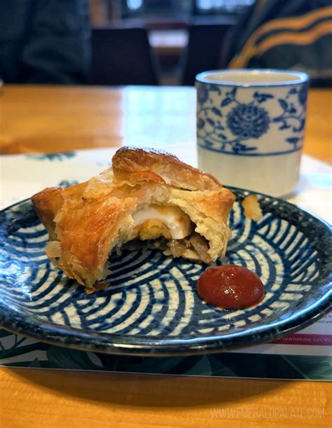
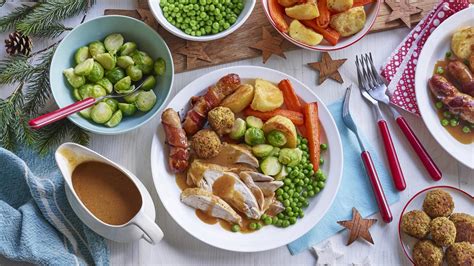
In the vibrant world of online food content, captivating visuals are the main course. From mouth-watering Instagram reels to stunning food blog photography, “visual bites” are designed to tantalize and inspire. But the real challenge for content creators and marketers lies in the next step: converting that initial visual allure into a tangible action, specifically guiding foodies to a full recipe page. What Call-to-Action (CTA) strategies, paired with these compelling visuals, prove most effective in transforming a fleeting moment of admiration into a dedicated cooking session?
Understanding the intricate relationship between visual appeal and conversion is paramount. It’s not just about showcasing beautiful food; it’s about seamlessly nudging the viewer from passive appreciation to active engagement. This article delves into the optimal visual CTA techniques that resonate most strongly with food enthusiasts, driving them directly to the detailed instructions they crave.
Decoding the Foodie Psyche: What Drives Them?
Before designing the perfect CTA, it’s crucial to understand what makes a foodie tick. Food enthusiasts are often driven by inspiration, curiosity, and the desire to recreate culinary experiences. They seek not just a pretty picture, but the story behind it, the promise of flavor, and the practical steps to achieve it themselves. A truly effective CTA taps into these intrinsic motivations.
- Inspiration: A stunning photo sparks an idea.
- Curiosity: How was it made? What are the ingredients?
- Aspiration: Can I make this myself?
- Practicality: Show me the recipe!
The CTA’s role is to bridge the gap between the aspirational visual and the practical application, making the journey to the recipe page feel natural and irresistible.
Top Visual CTA Strategies for Recipe Conversion
1. Explicit Buttons with Benefit-Driven Language
Direct and clear buttons remain highly effective. Phrases like “Get the Recipe,” “View Full Recipe,” or “Cook This Now” perform well. For foodies, adding a benefit-driven phrase can enhance appeal: “Unlock the Secret Recipe,” “Start Cooking This Delicious Meal,” or “Master This Dish.” The button’s design should contrast with the background, ensuring high visibility without clashing with the food aesthetic.
2. Text Overlays and Contextual Links
For platforms where direct buttons are less native (e.g., some social media stories), text overlays with a clear call to action (e.g., “Swipe Up for Recipe,” “Link in Bio for Full Instructions”) are essential. The text should be legible, short, and positioned strategically so as not to obscure the food itself. Contextual links within blog posts, often embedded in recipe intros, also perform strongly as they are anticipated by the reader.
3. Implied CTAs Through Interactive Elements
Sometimes, the CTA isn’t a button but an interactive element that naturally leads to the recipe. This could be a “Tap to Reveal Ingredients” feature that then offers a link to the full recipe, or a carousel of steps with the final slide linking to the full guide. These immersive experiences can feel less like a hard sell and more like a guided journey.
Optimizing CTA Placement and Design
Where and how you place your CTA can significantly impact its conversion rate. For visual bites, immediacy is key. The CTA should be visible either directly on the image/video or immediately adjacent to it, especially in feeds or galleries. For blog posts, positioning it both at the beginning of the recipe description and again before the detailed ingredient list works best.
Design elements like color, font, and size also play a critical role. A CTA button should stand out, but not jarringly so. It should complement the overall aesthetic while drawing the eye. High contrast colors and clear, readable fonts are non-negotiable.

The Indispensable Role of A/B Testing
What works for one audience or platform might not work for another. The most effective way to determine the best visual CTA is through rigorous A/B testing. Experiment with different phrases (“Get Recipe” vs. “Cook This Dish”), button colors, sizes, placements, and even the surrounding copy. Track metrics like click-through rates (CTR) and conversion rates to recipe pages. Data-driven optimization is the only path to consistently improving your visual bite conversions.
- Test different CTA texts.
- Experiment with button colors and designs.
- Vary placement within visual content.
- Analyze CTR and recipe page visits.
Conclusion: Crafting the Perfect Culinary Hook
Converting foodies from mesmerizing visual bites to detailed recipe pages is an art form rooted in understanding user psychology and employing strategic CTAs. By focusing on clear, benefit-driven language, optimal placement, appealing design, and continuous A/B testing, content creators can significantly enhance their conversion rates. The goal is to make the transition from visual inspiration to culinary execution as seamless and enticing as the food itself, turning every ‘yum’ into a ‘let’s make this!’