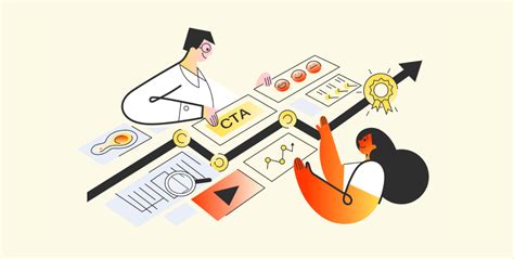
What’s the best CTA for Visual Bites to guide foodies to full recipes without friction?
In the vibrant world of online food content, platforms like “Visual Bites” captivate audiences with stunning imagery and short, enticing videos of delicious dishes. These platforms excel at sparking inspiration and cravings. However, the ultimate goal for many foodies is not just to view, but to create. The critical challenge lies in seamlessly guiding these inspired users from a mouth-watering visual snippet to the complete, detailed recipe without introducing friction that might deter them.
The Power of a Well-Placed Call to Action (CTA)
A Call to Action (CTA) is the bridge between engagement and conversion. For Visual Bites, a CTA needs to be more than just a button; it must be an intuitive invitation that promises a clear path to culinary success. An effective CTA reduces cognitive load, clearly communicates the next step, and aligns with the user’s intent to learn more about the dish presented. Without a compelling and accessible CTA, even the most captivating visual content risks becoming a dead end, leaving users frustrated rather than fulfilled.
Key Principles for Designing Frictionless CTAs
To craft the ideal CTA, several design and psychological principles come into play:
- Clarity and Directness: The user should instantly understand what will happen when they click. Ambiguity leads to hesitation.
- Visibility and Prominence: The CTA must stand out visually, using contrasting colors, appropriate sizing, and strategic placement within the visual bite’s interface.
- Desire and Benefit-Oriented Language: While directness is key, phrasing that subtly taps into the user’s desire to cook or eat can be more effective than generic terms.
- Mobile-First Design: Given that most users browse food content on mobile devices, CTAs must be thumb-friendly, clearly tappable, and not obscured by other UI elements.
- Consistency: The journey from the CTA to the recipe page should be consistent in branding and user experience.
Analyzing Specific CTA Phrasing Options
Let’s consider various phrases and their potential impact:
1. Direct and Functional: “Get the Recipe” / “View Full Recipe”
These are straightforward and leave no room for misunderstanding. They clearly state the outcome. “Get the Recipe” can feel slightly more action-oriented than “View Full Recipe.” They are universally understood and generally perform well due to their clarity.
2. Action-Oriented and Urgent: “Cook This Now” / “Make It Tonight”
These CTAs inject a sense of immediacy and excitement. They appeal to the user’s current inspiration and can be highly effective for dishes that seem quick or easy. However, they might not resonate if the recipe is perceived as complex or time-consuming, potentially creating a mismatch between expectation and reality.
3. Benefit-Driven and Informative: “Ingredients & Steps” / “See How It’s Made”
These phrases promise specific content, appealing to users who want to quickly gauge the complexity or availability of ingredients before committing to the full recipe. “See How It’s Made” works particularly well if the full recipe page also includes a video tutorial, further reducing friction by setting accurate expectations.
4. Interactive and Contextual: “Tap for Recipe” / “Swipe Up for Recipe”
These are highly suitable for platforms like Instagram Stories or TikTok, where “swipe up” or “tap” is a common interaction pattern. They are intuitive for mobile users and leverage established platform behaviors, making the transition feel natural rather than forced.
Minimizing Friction Beyond the Click
The CTA’s job doesn’t end when the user clicks. Friction can occur at multiple points in the user journey:
- Loading Speed: A slow-loading recipe page is a major deterrent. Optimize images and code for quick load times.
- Cluttered Recipe Pages: Once on the recipe page, information should be easy to find. Avoid excessive ads, pop-ups, or confusing layouts.
- Mobile Responsiveness: Ensure the full recipe page is perfectly optimized for mobile viewing, with readable fonts and easily navigable sections.
- Clear Navigation Back: Provide an easy way for users to return to the Visual Bites platform if they wish.
The Verdict: A/B Testing is Key
While “Get the Recipe” or “View Full Recipe” often serve as excellent starting points due to their universal clarity and directness, the “best” CTA is ultimately determined by your specific audience and platform. Implementing A/B testing is crucial to understand which phrasing, color, size, and placement yields the highest conversion rates for your Visual Bites content.
For platforms heavily reliant on short-form video and mobile interaction, a contextual CTA like “Tap for Recipe” or a prominent, well-designed “Get the Recipe” button that appears at the end of the video or immediately below the image may prove most effective. The goal is always to anticipate the user’s next logical step and make that step as effortless and inviting as possible, transforming inspiration into action.