Which ‘Visual Bites’ CTA design drives most recipe saves from foodies?

The Quest for the Perfect ‘Save Recipe’ CTA
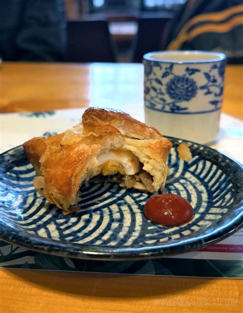
In the dynamic world of online food content, capturing a foodie’s attention is only half the battle. The ultimate goal for many recipe publishers is to drive engagement, and few metrics are as valuable as a ‘recipe save.’ When a user saves a recipe, it signifies a strong intent to return, try the dish, or simply keep it for future reference. For ‘Visual Bites’ – short, engaging, and highly visual food content – the Call-to-Action (CTA) design becomes paramount in converting passive viewers into active savers.
This article delves into the critical elements of CTA design, exploring which visual and textual cues are most effective in prompting food enthusiasts to hit that ‘save’ button. We’ll examine different approaches, consider the psychology behind saving, and discuss how A/B testing can unveil the winning formula.
Understanding the Foodie Psychology of Saving
Before designing an effective CTA, it’s crucial to understand why foodies save recipes. They’re often looking for inspiration, planning meals, or cataloging dishes they’ve enjoyed or wish to try. A save represents a commitment, a bookmark in their culinary journey. Therefore, a successful CTA must not only be visually appealing but also align with the user’s intent and provide clear value. Foodies appreciate ease of use, clear instructions, and a seamless experience that allows them to quickly add a recipe to their personal collection without interrupting their browsing flow.
Key CTA Design Elements Under the Microscope
Optimizing a CTA for recipe saves involves scrutinizing several design components:
- Placement: Where should the CTA appear? Common placements include immediately below the recipe title, within the recipe steps, or at the very end. Early placement can capture immediate interest, while later placement might appeal after the user has absorbed more of the recipe’s details.
- Text and Wording: The language used can significantly impact conversion. “Save Recipe,” “Pin It,” “Add to Favorites,” “Try This Later,” or even a simple heart icon can evoke different responses. Clarity, conciseness, and action-oriented verbs are key.
- Visual Cues: Color, size, shape, and iconography play a massive role. A prominent button color that contrasts with the background, a universally recognized bookmark or heart icon, and a clear button shape can draw the eye and communicate intent instantly.

The Power of Context and Interactivity
Beyond static design, the context in which the CTA appears and any interactive elements can boost performance. A CTA that appears after a particularly mouth-watering image or a compelling step-by-step video might perform better. Subtle animations on hover, or a confirmation message upon saving, can also enhance the user experience and reinforce the action.
Setting Up Effective A/B Tests
To truly understand which CTA design drives the most recipe saves, A/B testing is indispensable. This involves creating at least two versions of your content, each with a different CTA design element, and showing them to comparable segments of your audience. Key metrics to track include:
- Click-Through Rate (CTR): The percentage of users who clicked the CTA.
- Save Rate: The percentage of users who successfully saved the recipe after clicking.
- Engagement Time: Does one CTA design lead to longer interaction with the content?
Remember to test one variable at a time (e.g., only button color, then only text, then only placement) to isolate the impact of each change. Large enough sample sizes are crucial for statistical significance.
Hypotheses and Potential Winning Strategies
While specific results will vary by audience and platform, some general hypotheses can guide your testing. For ‘Visual Bites’ content, which thrives on immediate appeal:
- A prominent, visually distinct ‘Save’ button with a universally recognized icon (like a bookmark or heart) placed early in the content might perform well due to the immediate gratification it offers.
- Action-oriented, concise text like “Save Recipe” or “Save for Later” often outperforms longer phrases.
- Contextual CTAs appearing after a particularly enticing visual or a short, engaging video segment could see higher engagement as the user’s interest is piqued.
- A sticky CTA that remains visible as the user scrolls might also prove effective, especially on mobile devices.
Conclusion: The Data-Driven Path to More Recipe Saves
Optimizing your ‘Visual Bites’ CTA design is an ongoing process of experimentation and refinement. There’s no one-size-fits-all answer, but by understanding your audience, breaking down your CTA into testable elements, and diligently A/B testing, you can uncover the designs that resonate most strongly with foodies. The goal is to create a seamless, intuitive, and appealing path for users to save their favorite recipes, ultimately boosting engagement and building a loyal community around your culinary content.